20. February 2025
The Underestimated Impact of Colour on Interior Architecture
Colours have an oft-underestimated impact on interiors. They lend shape to rooms, direct our gaze and influence our well-being. Read more about how targeted colour concepts transform the way we experience spaces.

Author
Isabelle D'Angelo
The hidden complexity of the colour cosmos
As an interior architect, I have often noticed that colours do not get enough credit for their influence on design and spatial elements. Many people balk at bold colour concepts, whether out of uncertainty or the fear of making mistakes. Yet the human eye can, according to the University of Mannheim, distinguish approximately 200 hues, and each of these in 500 different levels of lightness. If you factor in possible brightening through white content, you get a visual spectrum of around 20 million hues. While this vast range explains our frequent uncertainty about colours, it also harbours a great deal of creative potential!
Colour is not necessarily colourful
One common misconception is that colour and colourfulness (or chroma) are the same thing. Actually, the term “colourful” or refers to colours with a high level of saturation. A colour’s power often lies in a subtle interplay of slight nuances that can hardly be perceived at first glance but have a profound effect. For instance, a slightly toned wall can make the colours of works of art appear more vibrant than a white wall – which is why many galleries and museums have grey walls.
The world-famous Natural Colour System® (NCS) recently expanded its palette to include another 100 new colours with a low chroma. These subtle colour nuances are having a moment in interior design now because they offer a variety of possibilities for sophisticated and contemporary colour concepts. This expansion emphasises the growing trend towards colours that give spaces depth and character without being obtrusive.
Using colour strategically
Well-deployed colours are much more than just decorative elements. They arouse emotions, create atmospheres and can even affect our behaviour. Whether you want a delicate nuance or a loud accent, the key to choosing the right colour is having a clear vision of what you want the space or experience of it to be like. And this vision should serve as the foundation for the rest of your chromatic decisions. It is therefore crucial in any interior architecture project to consider colours from the start of the design process.
Colours also provide excellent possibilities for visually refreshing a space without doing a full renovation of it. Simple actions like painting the walls or changing the colours of your upholstery can create a completely new ambiance in a heartbeat. These sorts of colour interventions make it possible to efficiently and affordably transform interiors.
Colour zones, contrasts and concealing
Targeted colour placement can divide spaces into zones and create uniformity. Connecting individual walls through colour creates a sense of spaciousness. One good way of creating clarity in very large spaces is through contrasts – such as light-dark, cold-warm, colour contrasts or quality contrasts (saturation level). Colours have the power to guide and organize.
They can also conceal unsightly areas or structural features. Dark colours allow elements to recede and also create depth, while light colours accentuate and direct the gaze. Interestingly, white – which is often viewed as a safe value – is not considered neutral at all, but dominant. It can unwittingly highlight things that would be better left in the background.


The interplay of colour, light and material
A good colour concept is not created on its own, but together with the lighting and materials. For instance, warm-coloured wood combines beautifully with cool hues to create fascinating contrasts. Colours can heighten, tone down or contrast existing materials.
Lighting concepts play a decisive role and should absolutely be coordinated with specialist planners based on the colours that have been chosen. One big caveat is the use of the colour yellow: it requires a lot of natural light to have its full impact. The rule of thumb is: bright and loud colours in the light, shadowy colours in the shadows.
The light quality is also important. The Colour Rendering Index (CRI) of a light source indicates the light source’s ability to reproduce colours as natural light would. For an optimum colour rendering, you should choose light sources with a CRI value over 90, ideally over 95 (for more on the topic of light design, check out this Space Story by Stefan Baumeler).
Colours and our behaviour
The impact of colours goes far beyond the visual. Similarly to acoustics, colours can also influence our subconscious and even our behaviour. In the restaurant industry, for example, the colour of the crockery can influence a person’s appetite: they say warm, subtle colours stimulate it, while cool blue hues diminish it and may cause people to eat their food more slowly.
A noticeable contrast between the colour of the food and the tableware can also affect eating behaviour. Usually we eat less when the food appears more interesting and colourful due to a strong contrast.
Making the case for bold colour concepts
The impact and, consequently, the power of colour in interior architecture should not be underestimated. From subtle nuances to bold statements – colours are an indispensable tool for interior architects. While they require careful planning and a deep understanding of their of their effect, they offer endless possibilities for transforming spaces and arousing emotions.
Note: The original version of this article was published in the December 2024 issue of the htr hotelrevue.
Show your true colours with us and take your interior architecture project to the next level
Isabelle D'Angelo
Innenarchitektin
Explore More Space Stories
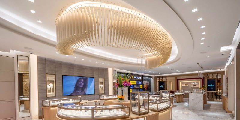
Space Story #44 | 14 November 2024
From Vision to Reality: The Development of an Unusual Chandelier
Our team engineered a unique chandelier for Mayors Jewelers in Miami. In this post, interior architect Deborah Muff talks about the challenges that emerged in the process and our creative solutions to them.
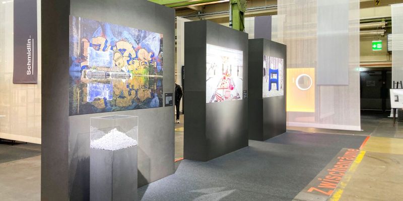
Space Story #43 | 17 October 2024
Our Aspiring Interior Designers at the neue raeume Trade Fair
Vivien Bucher and Rebecca Betschart are currently advancing their education as interior designers. As part of their further training, they conceptualised, planned, and implemented a trade fair stand for the neue raeume 2024 trade fair. An experience report.